James McManus
Metal cards are weirdly honest objects. You can’t hide behind coatings and soft edges forever. The light hits, your fingertips judge, and whatever you chose, cutouts, engraving, etching, either holds up or quietly betrays you.
And yes, these techniques are “decorative.” But that’s not the point. They’re structural decisions disguised as style.
The base layer: material isn’t a backdrop, it’s the whole game
Now, this won’t apply to everyone, but if you pick material after you design the typography, you’re already negotiating from a bad position.
A few realities that tend to win arguments in production meetings:
– Hardness changes what “detail” even means. Softer metals will take a mark easily, and they’ll also pick up scratches easily. Harder metals keep crispness longer, but certain processes become slower or more expensive.
– Finish controls readability more than font choice. A mirrored surface can make “high contrast” graphics look invisible under overhead lighting, while a brushed finish can rescue mediocre type just by scattering reflections.
– Thickness is a typographic variable. Go thin and your card feels sharp (sometimes literally). Go thick and you buy authority, but you also increase edge exposure and weight.
Look, I love clever type. But metal doesn’t care about clever. It cares about physics, which is why makers like Metal Kards have to treat material choice as a core design decision rather than a finishing touch.
One quick data point to anchor the “durability vs. readability” conversation: anodized aluminum layers are commonly in the ~5, 25 μm range depending on Type II vs. Type III (hard anodizing toward the thicker end). That’s not a design abstraction, that’s the ceiling for how much micro-contrast you can reliably build into certain marks before wear or specular glare starts flattening them. Source: MIL-A-8625 (U.S. military specification for anodic coatings on aluminum).
One-line truth:
Material choice decides what details survive.
Cutouts: negative space that behaves like typography
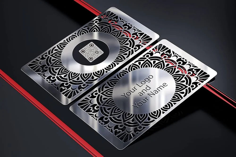
Cutouts are not just “holes.” They’re pauses. They’re rhythm. They’re the designer admitting that empty space can speak louder than ink (or in this case, metal).
What cutouts do well
They make a card feel engineered. Lighter. More intentional. The silhouette becomes branding, not just the printed face.
The tricky part is legibility. If you’re cutting through letterforms, you’re committing to a kind of typographic sculpture. That’s gorgeous when it’s controlled, and messy when it’s trying too hard.
A few practical notes from builds I’ve seen go right, and wrong:
– Bridge widths matter. If your cutouts create skinny “islands” of metal, those islands will bend, snag, or fatigue. This shows up fast on cards that live in wallets.
– Edge treatment is the hidden hero. A sharp edge reads crisp but feels aggressive. A small chamfer can make the same cut feel premium and intentional. Rounded edges soften everything, sometimes too much.
– Light becomes your second ink. Tilt the card and your negative space changes contrast. Great for drama. Bad for tiny informational text.
Cutouts shine when the card is meant to move visually.
Engraving (the tactile flex)
Here’s my blunt opinion: engraving is the most “metal” looking thing you can do to a metal card. Printing can feel like an overlay. Engraving feels like the object is telling the story itself.
Engraving gives you depth, shadow, and that satisfying fingertip confirmation that something is real. It also gives you control over hierarchy in a way flat marking struggles to match. You can make a logo feel anchored while letting secondary text sit back.
And it’s not all romance, there are constraints.
The specialist briefing version
Engraved lines are geometry. Their visibility depends on:
– Line width and depth
– Tool path consistency (or laser parameters)
– Surface finish reflectivity
– Viewing angle and lighting
Too shallow and you get “pretty in raking light, gone in overhead light.” Too deep and you risk burrs, dirt-catching grooves, and a design that feels like a coin replica instead of a modern card.
In my experience, engraving is where designers either become disciplined… or spiral into micro-patterns that look great in renderings and turn into mud in real life.
One small paragraph, because it deserves it:
Texture is a legibility tool, not just a vibe.
Etching: quiet contrast and better aging than you’d expect
Etching is the introvert of this trio. It doesn’t scream. It doesn’t even talk loudly. It just keeps showing up under different light like, “yeah, I’m still here.”
If engraving is about depth you can feel, etching is about recession you can notice. It’s fantastic for subtle fields, background patterning, and tone-on-tone logos that don’t want to look stamped on.
Here’s the thing: etching often wears more gracefully than people assume, because it can “blend” with patina and micro-scratching. Depending on finish, a lightly etched area can either soften and become more atmospheric, or it can sharpen as surrounding surfaces polish through handling. That sounds contradictory, but metal surfaces are like that (especially if the card lives in a pocket with keys, dust, and friction).
If your goal is premium understatement, etching is hard to beat.
A slightly messy but honest way to choose between them
Ask yourself what you want the card to do in the first two seconds.
Not ten seconds. Two.
If you want immediate silhouette recognition: cutouts.
If you want fingertips to do the marketing: engraving.
If you want “expensive but restrained” from across a table: etching.
Budget and timeline do matter, obviously. Still, the bigger limiter is usually revision tolerance. Cutouts are unforgiving, change the geometry and you may change structural integrity. Engraving is more editable, but dense artwork can balloon time. Etching is flexible for field effects, though dialing contrast can take iteration.
A short list that actually helps:
– Choose cutouts when you can design around structural bridges and you want light to participate.
– Choose engraving when hierarchy and tactile depth are the point.
– Choose etching when you want subtle branding that survives scuffs without looking “damaged.”
Final thought (not a wrap-up, just a reality check)
A metal card doesn’t reward indecision. Pick a technique, then let it dominate like it deserves to.
The worst outcomes I see are “a little of everything” designs, half-cut, half-etched, half-engraved, where nothing gets to feel intentional. Commit. Let one method carry the voice, and let the others support it quietly (like good typography does).